Chapter9Preparing Influenza Data to Compare With a Model
Goals
Distinguish between the vocabulary terms incidence and prevalence when describing categories of infectious cases in an outbreak
Translate the numbers in a typical data set from an outbreak into a related set of numbers that we can compare with the output of a model
Build skills for working with numbers and formulas in a spreadsheet
At this point, we have studied compartmental models, mathematical analysis of models, and multiple variations to those models. You can now develop models for many different kinds of infectious disease outbreak and for a variety of public health interventions that can be used to stop, slow, or reduce the size of the outbreak.
Next, we begin a three-chapter foray into comparing models with data. In this chapter, we start with a typical data set that shows how many new cases occur per day (or per week, month, or other time period), and we restructure those numbers into a set of numbers that more meaningfully compares with the models we write. Chapter 10 introduces Python code for fitting a model to a data set, adjusting parameters within the model to improve the fit. Then, in Chapter 11, we compare multiple models for the same outbreak.
Begin in Exploration 9.1 by investigating data sets generated by the Zombie Game App. We will use different columns of data from this app to help us think about how typical real-world disease data sets can compare with the kinds of compartmental models we have been studying.
Exploration9.1.Comparing Data: New Zombies vs. All Current Zombies.
We return to the Zombie Game App, using the Zombie Mortality feature in a similar way to what we first saw in Exploration 4.1. This time, our goal is to distinguish between the data for # Zombies and the data for New Infections.
(a)
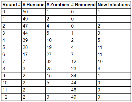
The data table below comes from the Zombie Game App. This table results from a simulation in which zombies are designated as mortal, with a “lifespan” (if zombies can be said to have a lifespan) of two days. Once a zombie surpasses its lifespan, it moves to the Removed category, meaning it no longer appears on the hex grid and can no longer infect humans.
Figure9.1.Table of sample data from a human–zombie simulation in which zombies have a two-day lifespan
On paper or in a spreadsheet: create a plot with Round # on the horizontal axis and # Zombies on the vertical axis. Separately, create a plot with Round # on the horizontal axis and New Infections on the vertical axis.
Make at least three observations, comparing and contrasting the two plots you have made.
to generate your own data. Within the app, check the box labeled Zombie Mortality, located under the heading Other Options. Once you do so, you can select the Zombie Lifespan (days). Then run the game and make note of your resulting data table. Again, graph the data for # Zombies and for New Infections, as you did in part (a).
Which of your observations from part (a) remain true? If any change, which observations change, and in what ways do they change?
in part (b), you may also choose to change the default Human Start Count to make it more likely for Humans to win the game. Write out at least three different combinations of Zombie Lifespan (days) and Human Start Count that you used and found that Humans won the game.
Next, investigate the question: when keeping Zombie Lifespan (days) the same, does increasing or decreasing the Human Start Count make it more likely for Humans to win? Support your response using evidence you generate from the Zombie Game App.
What mathematical epidemiology quantity that we have studied provides insight into answering the question in the previous paragraph?
Section9.1Incidence and Prevalence
When studying mathematical epidemiology, it helps to distinguish between the epidemiological terms incidence and prevalence. Incidence is a measure of new cases within a specified time unit, such as new cases per day or new cases per week. Prevalence is the total number of active cases at a given time, which means that prevalence includes both new cases and already-existing cases. Activity 9.2 provides practice with these terms, as they relate to data from the Zombie Game App and to solution curves from SIR models.
Activity9.2.
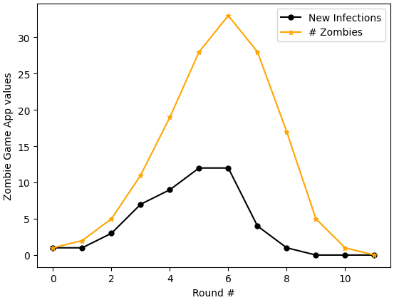
Below is a graph created from a data set generated by the Zombie Game App. This data set was created using the same app settings as the data in Figure 9.1, that is, zombies are mortal and have a two-day “lifespan”. The specific data values here are different than those in Figure 9.1.
Figure9.2.Graph of New Infections vs. Round Number, and Number of Zombies vs. Round Number, created using data from a Zombie Game App simulation in which zombies have a two-day lifespan
Spend some time thinking about the graph in Figure 9.2 while also thinking about your work in Exploration 9.1. Then respond to the following prompts.
First, simply list observations you had while comparing Figure 9.2 with what you did in Exploration 9.1. List at least three observations.
Next, read carefully the descriptions for incidence and prevalence at the start of Section 9.1. Which of the curves in Figure 9.2 seems to you to better represent incidence? And which curve seems to better represent prevalence? Explain your reasoning.
Now compare Figure 9.2 with graphs you have seen for SIR models, when we plot solution curves for \(S(t)\text{,}\)\(I(t)\text{,}\) and \(R(t)\text{.}\) Which of the data plots in Figure 9.2 -- the New Infections plot, or the # Zombies plot -- seems better for comparing with the \(I(t)\) curve we would generate in an SIR model of an outbreak?
Answer.
There can be many kinds of observations. Be thoughtful; be creative; think broadly.
The New Infections curve tells us the number of new cases per round, and this closely mirrors the wording in the definition of incidence. The # Zombies curve tells us the total number of active zombies per round, and this wording is very similar to wording in the definition of prevalence.
The \(I(t)\) curve often describes all active infections at a given time \(t\text{.}\) This compares best with the data for # Zombies vs. time. (This is not a perfect comparison for every outbreak, as sometimes \(I(t)\) means a person is contagious but does not yet show symptoms. However, in the basic zombie game, where is a person is contagious exactly when they are a zombie, the \(I(t)\) curve is well matched with data for # Zombies.)
It turns out that outbreak data typically take a format similar to the numbers shown in the New Infections column of data in the Zombie Game App. These numbers may be shared as a table of values, or in a graphical format, such as a histogram. In order to compare the number of new cases in an outbreak with the \(I(t)\) curve in an SIR model (or other compartmental model), we need to use what we know about the outbreak to convert the numbers of new cases into the number of people in the I compartment at each time step of the outbreak. This is our goal in Section 9.2.
Section9.2Translating a Typical Data Set Into Numbers We Can Compare With a Model
In the fall of 2009, Bates College experienced an outbreak of H1N1 influenza. The initiating event appeared to be Parents’ and Families’ Weekend, a time when relatives of students were invited to campus for a weekend of events together. Shortly thereafter, the first confirmed cases of H1N1 appeared on campus. There were multiple initial infections, due to several students independently becoming infected after visitors came to campus.
Before the fall 2009 semester, college officials at Bates and elsewhere had been preparing for the newly emerged H1N1 influenza virus. While the specific influenza viruses that circulate each year differ somewhat from those that circulated in previous years, the 2009 H1N1 virus had distinct genetic differences from any influenza viruses that had ever been studied in humans. The World Health Organization 3
describe more about the differences on their websites. The novelty of the fall 2009 H1N1 virus led to heightened concern about large outbreaks and possible effects on people of all ages.
In Activity 9.3 we work with real data collected during the Bates outbreak. Starting with this data set, which is shown in Table 9.3, we think through how to convert data into numbers we can compare with an SIR model for the spread of H1N1 influenza in which the unit of time is days.
Activity9.3.
After the 2009 outbreak of H1N1 influenza virus on the Bates College campus, the Dean of Students and Student Health Services were kind enough to share their data on new infections among students. As is common with data sets for an outbreak: information that could identify specific individuals has been removed, and the data set takes the form of new case reports. The data set appears in Table 9.3.
Table9.3.Student case reports of H1N1 in fall 2009 at Bates College
Day of Week
Date
New Cases Reported
Tuesday
October 6
5
Wednesday
October 7
8
Thursday
October 8
2
Friday
October 9
6
Saturday
October 10
6
Sunday
October 11
15
Monday
October 12
28
Tuesday
October 13
53
Wednesday
October 14
44
Thursday
October 15
20
Friday
October 16
12
Saturday
October 17
9
Sunday
October 18
17
Monday
October 19
21
Tuesday
October 20
7
Influenza moves quickly. The incubation period is short, often just two days or even shorter, and people can become contagious before showing symptoms. 5
Two articles to support this are “2009 H1N1 Influenza” by Seth J. Sullivan, Robert M. Jacobson, Walter R. Dowdle, and Gregory A. Poland, published January 2010 in the Mayo Clinic Proceedings, and “Outbreak of 2009 pandemic influenza A (H1N1) at a New York City school” by Justin Lessler, Nicholas G. Reich, and Derek A. T. Cummings, published in 2009 in the New England Journal of Medicine.
For this reason, we use an SIR model instead of an SEIR model. There are multiple estimates for how long people remain contagious, with five days as a commonly provided number, though for some people the contagious period may be a little shorter or a few days longer. 6
The European Centre for Disease Prevention and Control includes the estimate of five days for adults and seven days for children on their web page “Questions and answers on the pandemic (H1N1) 2009”, last accessed 16 September 2024, available at https://www.ecdc.europa.eu/en/seasonal-influenza/2009-influenza-h1n1-faq.
Given this information about the incubation period and contagious period of H1N1, follow the steps below to convert the incidence data in Table 9.3 to prevalence numbers that can be compared with the I compartment of an SIR model in which the time unit is days.
and making your own copy. Alternatively, create your table by opening a blank spreadsheet and copying into it the data from Table 9.3.
Create a new column in your table and give this new column the title “Prevalence”. Compute the H1N1 prevalence for each day by supposing that people are contagious for five days. Measuring prevalence, the number of contagious people, and the number of people in the \(I(t)\) compartment are essentially the same for H1N1, as people become contagious very close to the time when they begin showing symptoms, and they stop being contagious approximately when they stop showing symptoms. This means, for instance, that the five initial cases from October 6 remain in the Prevalence column, and hence in \(I(t)\text{,}\) for October 6, 7, 8, 9, and 10. Then, on October 11, the five cases from October 6 should no longer be in the Prevalence column.
Extend the length of your Prevalence column so that it represents the full five days of contagion for all the New Cases Reported. To extend the length of the Prevalence column, add extra rows at the bottom of the table. The last row should have a Prevalence value of \(0\) (and should be the first row in which Prevalence equals \(0\)).
Create a plot showing New Cases Reported on the vertical axis, with time on the horizontal axis. The horizontal axis in your chart should show the dates. On the same axes, create a plot showing Prevalence on the vertical axis, with time again on the horizontal axis.
To create this type of spreadsheet plot in Google Sheets, choose menu item Insert, then choose Chart, and then in the Chart Editor, select Line chart. The Chart Editor provides several ways to edit the chart.
Alternatively, in Microsoft Excel, choose menu item Insert, and then from the Chart menu, select one of the Scatter options.
Discuss with your group: how does each of the two plots compare (or not) with typical \(I(t)\) curves in outbreaks? Make three or more observations.
Bonus spreadsheet work, if time permits: go back to the Prevalence column you created. If you have not yet used spreadsheet formulas to determine the column entries, try to do so. Formulas let you refer to other cells in the spreadsheet, rather than re-typing their numbers every time you re-use the same numbers.
Answer.
Table 9.4 shows the H1N1 data along with the prevalence values, including extra rows to display prevalence for all cases of H1N1.
Table9.4.Student case reports of H1N1 in fall 2009 at Bates College
Day of Week
Date
New Cases Reported
Prevalence
Tuesday
October 6
5
5
Wednesday
October 7
8
13
Thursday
October 8
2
15
Friday
October 9
6
21
Saturday
October 10
6
27
Sunday
October 11
15
37
Monday
October 12
28
57
Tuesday
October 13
53
108
Wednesday
October 14
44
146
Thursday
October 15
20
160
Friday
October 16
12
157
Saturday
October 17
9
138
Sunday
October 18
17
102
Monday
October 19
21
79
Tuesday
October 20
7
66
Wednesday
October 21
0
54
Thursday
October 22
0
45
Friday
October 23
0
28
Saturday
October 24
0
7
Sunday
October 25
0
0
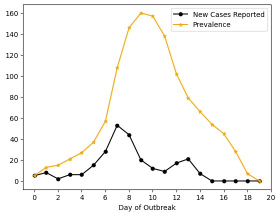
Here is one possible graph of the results.
Figure9.5.This is a graph showing two plots of the H1N1 outbreak at Bates College in 2009. The plot in black shows new cases, as reported by Student Health Services. The plot in orange shows estimated prevalence, assuming influenza is infectious for five days. The horizontal axis shows days since the start of the outbreak, starting at Day 0, where Day 0 is October 6, 2009, the first day cases began to be reported.
Observations. Observations about the plots may be wide-ranging: this is open-ended. One possible observation is that the New Cases Reported plot has two mini-peaks, compared with the single, more-obvious, peak in the Prevalence plot. Another possible observation is to compare with a typical \(I(t)\) curve and notice that the Prevalence plot is more similar in appearance than the New Cases Reported plot. Another possible observation is that the Prevalence plot includes higher numbers of students than the New Cases Reported plot, which makes sense, since we count students across each day they are sick, rather than just once when they report that they are sick. These are a few common observations, but to emphasize: there are many more possible. Keep seeking more.
Spreadsheet Formulas. For the Prevalence column, rather than compute values ourself, we can let the spreadsheet do this for us. If you copied the shared spreadsheet, the data values begin in row 5, and Prevalence appears in column D.
To compute prevalence on October 6, rather than type in the number 5, you can type in =C5 to bring in the value 5 from cell C5.
In cell D6, for prevalence on October 7, rather than add 5 and 8 to obtain 13, you can type =C5+C6.
Similarly, for cell D7, have the spreadsheet add the numbers for cells C5, C6, and C7. For cell D8, have the spreadsheet add the numbers for cells C5, C6, C7, and C8.
Here (along with the next step) is where we start to see how a spreadsheet can automate work for us. For cell D9, use the sum function. Type =sum(C5:C9) to have the spreadsheet add the numbers for all the cells from C5 to C9, that is: C5, C6, C7, C8, and C9.
Now we can stop typing so much. Copy what you typed in cell D9, and paste it into the rest of your prevalence cells in column D. To match the table in Table 9.4, this means pasting into cells D10 through D24. Notice that the spreadsheet does not always add the values in cells C5 through C9: instead, the spreadsheet adds the values in the five cells that are in similar locations, relative to the prevalence cell being computed. To see which cells are being added to obtain each prevalence value, click on that cell in the prevalence column and view the formula.
There is more than one way to compute the formulas for the Prevalence column. If you used spreadsheet formulas but found a different approach (such as starting with the prevalence value the day before, adding the new cases for that day, and subtracting the cases from five days earlier), and if your approach resulted in the same values, then well done!
Activity 9.3 is lengthy! There is a lot to work through. Mathematically, we are mostly adding numbers, but we must make sure to do so in a way that correctly represents real data from a real outbreak.
Completing Activity 9.3 is adequate for comparing influenza prevalence data with the \(I(t)\) compartment of a model. However, at times we may want to compare another compartment of a model to the appropriate data. In Activity 9.4, continue your work from Activity 9.3 to convert the Bates 2009 H1N1 data set into values that can be compared with the \(S(t)\) and \(R(t)\) compartments.
Then follow the steps below to convert New Cases Reported data into data points that can be compared with an SIR model in which the time unit is days.
To the right of the New Cases Reported column, create columns for \(S(t)\text{,}\)\(I(t)\text{,}\) and \(R(t)\text{.}\)
In the \(I(t)\) column, enter the numbers or formulas you developed in Activity 9.3 to represent the prevalence values for this H1N1 outbreak. In other words: replicate your work from Activity 9.3, this time placing those values in the \(I(t)\) column.
Similarly to what you did in Activity 9.3, extend the number of rows in the spreadsheet so that the prevalence values, shown here as the \(I(t)\) column, continue until no one remains in the Infectious compartment.
Next, fill in the \(S(t)\) column, using the knowledge that there were a total of 1714 students on campus that semester. On October 6, then, there should be \(1714-5=1709\) Susceptible people. For each day following that, determine that day’s \(S(t)\) value by subtracting the New Cases Reported from the previous day’s number of Susceptibles.
Then, fill in the \(R(t)\) column. To do this, fill in zeroes for the first few days. Continue to think of the contagious period, and the time in the Infectious compartment, as lasting five days. This means that the New Cases Reported on October 6 are in \(I(t)\) for the days October 6, 7, 8, 9, and 10, and then move into \(R(t)\) on October 11, so \(R(t)=5\) on October 11. On October 12, the New Cases Reported from October 7 move into \(R(t)\text{,}\) so \(R(t)=5+8=13\) on October 12. Continue similarly: on each day, update the \(R(t)\) column by adding the New Cases Reported from five days earlier.
Check your work: create one more column titled “Check Total”. For each row, add the three values in the \(S(t)\text{,}\)\(I(t)\text{,}\) and \(R(t)\) columns. The resulting numbers should be the same every day, since compartmental models require that every person be in exactly one compartment at each time step. This column is one way to check your work and find possible mistakes: if the numbers do not add up to 1714 on any day(s), there must be an error.
Bonus spreadsheet work: if you added and subtracted cases on your own and entered those numbers in the spreadsheet cells, go back and do all the steps from this activity using formulas.
Answer.
Table 9.6 shows the H1N1 data along with the \(S(t)\text{,}\)\(I(t)\text{,}\) and \(R(t)\) values for the full outbreak.
Table9.6.Student case reports of H1N1 in fall 2009 at Bates College
Day of Week
Date
New Cases Reported
\(S(t)\)
\(I(t)\)
\(R(t)\)
Check Total
Tuesday
October 6
5
1709
5
0
1714
Wednesday
October 7
8
1701
13
0
1714
Thursday
October 8
2
1699
15
0
1714
Friday
October 9
6
1693
21
0
1714
Saturday
October 10
6
1687
27
0
1714
Sunday
October 11
15
1672
37
5
1714
Monday
October 12
28
1644
57
13
1714
Tuesday
October 13
53
1591
108
15
1714
Wednesday
October 14
44
1547
146
21
1714
Thursday
October 15
20
1527
160
27
1714
Friday
October 16
12
1515
157
42
1714
Saturday
October 17
9
1506
138
70
1714
Sunday
October 18
17
1489
102
123
1714
Monday
October 19
21
1468
79
167
1714
Tuesday
October 20
7
1461
66
187
1714
Wednesday
October 21
0
1461
54
199
1714
Thursday
October 22
0
1461
45
208
1714
Friday
October 23
0
1461
28
225
1714
Saturday
October 24
0
1461
7
246
1714
Sunday
October 25
0
1461
0
253
1714
Spreadsheet Formulas. If you copied the shared spreadsheet, the \(S(t)\) values begin in row 5, column D, and the \(R(t)\) values begin in row 5, column F.
First compute the \(S(t)\) values.
To compute \(S(t)\) on October 6, rather than type in the number 1709, you can type in =1714-C5 to start with the 1714 students on campus and subtract the five New Cases Reported shown in cell C5.
In cell D6, for \(S(t)\) on October 7, you can type =D5-C6. This starts with the 1709 Susceptibles from cell D5 and subtracts the eight New Cases Reported in cell C6.
You can then copy the formula from cell D6 and paste the formula into the rest of column D. The spreadsheet formulas are relative rather than absolute. For our specific formulas, this means that each cell from D6 to D24 starts with the number in the cell directly above, and subtracts the number in the cell directly to the left. (If the formulas were absolute, we would always compute =D5-C6, but this would not compute correct values for \(S(t)\) at each day of the outbreak.)
Next compute the \(R(t)\) values.
Enter \(0\) for \(R(t)\) on October 6, 7, 8, 9, and 10, that is, in cells F5, F6, F7, F8, and F9.
In cell F10, for \(R(t)\) on October 11, you can type =F9+C5. This starts with the Removed population of 0 in cell F9 and adds the New Cases Reported in cell C5. These New Cases Reported have just moved from the Infectious compartment to the Removed compartment.
You can then copy the formula from cell F10 and paste the formula into the rest of column F. As described for computing the \(S(t)\) column: the formulas in the cells are relative, meaning that each day’s \(R(t)\) value is based on the previous day’s \(R(t)\) value and the number of New Cases Reported from five days earlier.
Finally, compute the “Check Total” values.
In cell G5, type =sum(D5:F5) or type =D5+E5+F5. Either of these formulas adds the \(S(t)\text{,}\)\(I(t)\text{,}\) and \(R(t)\) values for this row, and the result should be 1714.
You can then copy the formula from cell G5 and paste this formula into the rest of column G. Yet again: the formulas in the cells are relative, meaning that each day’s “Check Total” value is the sum of that day’s \(S(t)\text{,}\)\(I(t)\text{,}\) and \(R(t)\) values. Click on multiple cells in column G to confirm this. Then use this column to confirm that your result is 1714 in all of column G, from cell G5 down to cell G24. If any of your results do not equal 1714, this indicates an error somewhere in your spreadsheet. Take time to track down and fix any such errors.
There may be other ways to compute these formulas. If you used spreadsheet formulas but found a different approach, and if your approach resulted in the same values, then well done!
For Further Thought9.3For Further Thought
1.
Use your completed work from Activity 9.4 to create plots of the \(S(t)\text{,}\)\(I(t)\text{,}\) and \(R(t)\) data that can be constructed from the Bates H1N1 New Cases Reported data set. Describe three observations about the three plots you create and how they compare with the kinds of curves you have seen in Python solutions for SIR models. (If you did not complete Activity 9.4, transfer the results in Table 9.6 to a spreadsheet so that you can create the \(S(t)\text{,}\)\(I(t)\text{,}\) and \(R(t)\) graphs.)
2.
Recreate prevalence data for the data set in Table 9.3, but using different assumptions than in Activity 9.3. Here, instead of assuming a 5-day Infectious period, create prevalence data with the assumption that there is a 4-day Infectious period. Separately, create prevalence data with the assumption that there is a 6-day Infectious period.
On a single set of axes, plot the graphs of both 4-day prevalence and 6-day prevalence, that is, plot \(I(t)\) in the two cases when we think of influenza as contagious for four days and when we think of influenza as contagious for six days. Write at least three observations about these plots. At least two of your observations should directly compare the plots with each other.