Section 3.1 “Solving” Differential Equations Using Graphs
Our goal in this section is to learn to use Python to create graphs similar to what we saw in
Figure 2.7. Such a graph starts with a system of differential equations and draws one possible
graphical solution to that system. The graphical solution drawn depends on the equations themselves, the value(s) of any parameter(s), and the starting values for each population in the system, that is, the values when
\(t=0\) of
\(S(t)\text{,}\) \(I(t)\text{,}\) and any other populations being modeled. For now, we specify that this type of solution is a
graphical solution, but as the book continues, we will often refer to a graphical solution as simply a
solution.
One thing we will
almost never do is solve an entire system of differential equations in the way you may have seen in a calculus course, where we wrote the solution as a formula. To remind you how this often looks in calculus class—that is, how it looks to solve by writing the solution of a differential equation as a formula—we show an example in
Activity 3.2. Then
Activity 3.3 begins the discussion about why we use a different approach in this text.
Activity 3.2.
As we mentioned back in
Chapter 2, a differential equation is just an equation in which at least one term is a derivative. This means that an equation like
\(dy/dt=\cos t + 3\) is a differential equation.
Solving a differential equation often means finding a way to write an equivalent relationship, without including a derivative. Using this interpretation of “solving”: solve
\begin{gather*}
\frac{dy}{dt}=\cos t + 3.
\end{gather*}
Answer.
The general solution is \(y=\sin t + 3t + C\text{,}\) where \(C\) can be any constant. In this case, we solved by computing the antiderivatives of both sides of the differential equation.
Activity 3.3.
Now consider the SI model:
\begin{align*}
\frac{dS}{dt} \amp = -\beta S I \\
\frac{dI}{dt} \amp = \beta S I.
\end{align*}
What are the challenges to solving this system of equations, where “solving” means determining formulas that do not involve derivatives for \(S(t)\) and \(I(t)\text{?}\)
Hint.
There are many ways to answer this. One consideration is that each of the differential equations involves both \(S\) and \(I\text{.}\) This means the differential equations do not stand alone: each depends on the other. This interrelationship means we cannot just compute two separate antiderivative formulas.
Another consideration is that the right-hand side of the differential equation in
Activity 3.2 involves only
\(t\text{,}\) that is, only the independent variable. The dependent variable
\(y\) does not appear except in the derivative term
\(dy/dt\text{.}\) However, in the SI model system of equations, the dependent variables
\(S\) and
\(I\) appear in the derivatives
and elsewhere in the equations. Most antiderivative methods learned in a typical introductory Calculus course do not apply in this situation.
You may have thought of yet other challenges as well.
As discussed in
Activity 3.3, solving a system of differential equations is challenging. As we include more than two compartments, finding solution formulas for
\(S(t)\text{,}\) \(I(t)\text{,}\) and additional populations becomes yet more challenging, and is often impossible. Even when we can determine solution formulas, they are typically quite complicated to work with.
Instead, our approach is to compute numerical solutions, which are solutions in the form of numbers. The main idea is that Python starts at the initial population values, then uses the system of differential equations to “step through” the full range of time, computing population values step-by-step at later times by using information about how the population values change throughout. The system of differential equations is made up of derivatives, which are rates of change, so they exactly describe how the populations change at all times \(t\text{.}\) The population values computed in the numerical solution can be printed, or more often, graphed, to see the results in the form of a graphical solution.
We noted earlier that graphical solutions may be called simply solutions. Similarly, numerical solutions are sometimes called simply solutions. And we have seen that formula-based solutions can be called simply solutions. It is important to use context to determine which kind of solution is being discussed, in this text or in other reading.
Here is an outline of the numerical solution process.
Tell Python the formulas for the system of differential equations.
Tell Python which numbers to use for any parameters in the model. We select the numbers for a particular numerical solution, and we can use different numbers to create a different numerical solution.
Tell Python the initial conditions for each population, that is, the size of each population at the starting time of the model (which is usually \(t=0\)).
Tell Python when to start and stop the model, that is, the starting and ending values for time \(t\text{.}\) Also tell Python what time steps to use as Python “steps through” from the starting to the ending time.
Ask Python to use all this information to numerically solve the model and plot graphical solution curves.
Activity 3.4.
Read the Python code in the block below, and click the Evaluate (Sage) button to view the resulting graph. Think carefully about steps 1-5 in the outline above. Which lines of code address which steps of the outline? (Notice that you may need to scroll down within the code block. Alternatively, click the rectangular icon in the top right of the code block. This opens a full-screen version of the code. To return to the regular screen, click again the rectangle in the top right.)
Answer.
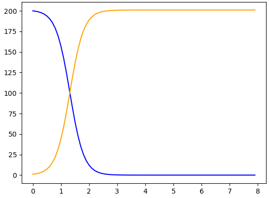
The formulas for the system of differential equations appear most directly in line 8, in order. The first formula is -beta * S * I, and the second formula is beta * S * I. Collectively, these are named dy/dt. More generally, the lines 6–9 define the system of differential equations.
In line 11, we give \(\beta\) the value of 0.02. This number can be changed, and the resulting numerical solution then changes accordingly.
In line 12, the initial conditions are set to \(S(0)=49\) and \(I(0)=1\text{.}\) These initial conditions are collectively named y0. The initial conditions appear in square brackets and are separated by a comma. This syntax should look familiar from line 8, when we entered the right-hand sides of the differential equations all in one command, using the same syntax.
The time range for this numerical solution appears in line 13, using the arange command from the numpy package downloaded in line 2. The code says t = np.arange(0.0, 8.0, 0.1). This means that time starts at \(t=0.0\) and continues till the step just before \(t=8.0\text{.}\) Therefore \(t=7.9\) is the last time step for which values of \(S(t)\) and \(I(t)\) are computed. In addition, the 0.1 tells Python to use a step size of 0.1 in the “step through” process for computing \(S(t)\) and \(I(t)\) values.
-
We ask in line 14 for Python to compute a solution, called sol. To compute this solution, Python uses the command odeint and the inputs hz (the differential equations in the model), y0 (the initial conditions for this solution), and t_range (the range of time across which to compute the solution). These commands produce a collection of numbers that describe the values of \(S(t)\) and \(I(t)\) at all the times specified in t_range. These numbers are arranged in two columns: one column for all the \(S(t)\) values, and one column for all the \(I(t)\) values.
The commands in lines 16-18 work together to create the plot we see after clicking Evaluate (Sage). Line 16 plots the blue \(S(t)\) curve, using the time inputs t_range and the values of \(S(t)\) throughout those times. The values of \(S(t)\) are described as sol[:, 0]. The : in sol[:, 0] indicates that we want all rows of the solution, which means the solution at all times \(t\text{.}\) The 0 in sol[:, 0] means that we want the \(S(t)\) values for each of those times. Python typically starts counting with 0 rather than 1, so the column of \(S(t)\) values is numbered as column 0 rather than column 1.
Line 17 plots the orange \(I(t)\) curve, using the time inputs t_range and the values of \(I(t)\) throughout those times, which are described as sol[:, 1]. This command is very similar to sol[:, 0], but whereas the \(S(t)\) values were in column \(0\) of sol, the \(I(t)\) values are in column 1 of sol.
Here is a summary of the Python code above, with some of the commands explained in more detail.
In the lines
     import matplotlib.pyplot as plt
     import numpy as np
     from scipy.integrate import odeint
we import online packages that make it possible for Python to do some of the things we are about to do. Saying we are importing “as” gives us a name, such as plt or np, by which to call each package and use the tools within that package.
The lines
     def hz(y, t):
       S, I = y
       dydt = [-beta * S * I, beta * S * I]
       return dydt
define the system of differential equations, using the command def. The system is named hz, for “human-zombie”, and the (y, t) means that the model depends on variables \(y\) and \(t\text{.}\) The line S, I = y defines \(y\) as comprising both \(S\) and \(I\text{,}\) in that order. This means that \(y\) collectively represents all our dependent variables. Taking the derivative of \(y\text{,}\) then, means taking each of the derivatives \(dS/dt\) and \(dI/dt\text{.}\) The formulas for these derivatives, which are on the right-hand sides of the SI model, appear in order in the line dydt = [-beta * S * I, beta * S * I]. Finally, the line return dydt ends the definition and says that whenever we later use the definition, we will be using the derivatives defined in dydt.
A quick way to think about these lines is that they define our system of differential equations and give them the name hz.
The lines
     beta = 0.02
     y0 = [49, 1]
     t_range = np.arange(0.0, 8.0, 0.1)
provide values for \(\beta\text{,}\) the initial conditions \(S(0)\) and \(I(0)\text{,}\) and \(t\text{.}\) Any of these values can be changed, and the code can be run again, to produce a different numerical simulation of the same system of differential equations. Notice that the initial conditions are listed in the same order as how we defined the differential equations: \(S(0)=49\) is first, and \(I(0)=1\) is second.
The solution of the system of differential equations
sol = odeint(hz, y0, t_range)
is a numerical solution, and it includes multiple parts. The solution is named sol. The Python command odeint computes the solution. For odeint to run, it needs three things: (1) a system of differential equations hz, (2) initial conditions y0 for the differential equations, and (3) a time range t_range across which to create the solution. Though odeint computes the numerical solution, it does not show us the graphical solution: the plots we create later show us these results. Instead, the numerical solution created by odeint consists of lists of numbers for \(S\) and for \(I\text{,}\) at the times specified in t_range. (If you would like to see the numerical values computed by sol, include the line print(sol) in the block of Python code above, sometime after the line sol = odeint(hz, y0, t_range). When you then evaluate the code, the list of values will appear.)
The lines
     plt.plot(t_range, sol[:, 0], color='blue')
     plt.plot(t_range, sol[:, 1], color='orange')
create, but do not show, the plots of graphical solutions to the system of differential equations. For each plot, we provide the input values t_range and the output values from the numerical solution sol. As described above, sol is a set of numbers which are the values of the populations \(S(t)\) and \(I(t)\) at all the times in t_range. The numbers in sol are structured into two lists, list 0 and list 1. (Python often counts things, such as lists, starting with 0 rather than starting with 1.) The syntax sol[:,0] describes all the \(S(t)\) data. The colon : means “all” the elements, and the 0 means list 0, which is the list containing values of \(S(t)\text{.}\) The syntax sol[:,1] describes all the \(I(t)\) data, with : again representing “all” and 1 representing list 1, which contains \(I(t)\) values.
The lines above include colors for each graph, 'blue' for the \(S(t)\) graph and 'orange' for the \(I(t)\) graph. Stating colors is optional.
Finally,
plt.show()
shows the two plots, on a shared set of axes.
To build further understanding of how the Python code works, it helps to make several small changes to the code. Simultaneously, we continue to build intuition for how the output graph is affected by our selected parameter values, initial conditions, time range, and more. Try this in
Activity 3.5.
Activity 3.5.
Start with the same Python code as in
Activity 3.4 and try various small changes to the code. Identify where and how in the code to make the changes suggested below, and discuss the effects of each change on the resulting graph. Here and elsewhere, whenever we work with Python, feel free to try your own adaptations to the code.
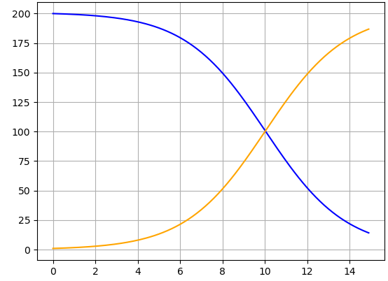
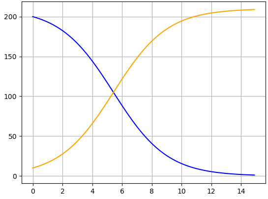
Change the value of \(\beta\text{.}\) Identify where in the Python code to make this change, and comment on how the output graph changes when \(\beta\) increases or decreases. (While you can change \(\beta\) to any value you like, recall that a realistic outbreak model requires \(\beta > 0\text{.}\))
Change the initial conditions so that \(S(0) \neq 49\text{,}\) \(I(0) \neq 1\text{,}\) or both. Comment on how these changes affect the resulting graph. (To stay in the realm of biologically feasible outbreaks, keep \(S(0) > 0\) and \(I(0) > 0\text{.}\))
Change the time range. Continue to begin at \(t=0\text{,}\) but change the end time to something different than \(t=8\text{.}\) Discuss reasons why a modeler may want to change the time range, and identify ways in which changing the time range causes the output graph to change.
Change the step size for time \(t\) so that Python steps forward in increments of 1.0 instead of 0.1. Identify where in the Python code to make this change, and observe any ways in which the output graph looks different after the change.
These are all the basics for numerically solving a system of differential equations. In
Section 3.2 we create a graph in which data points and solution curves appear all on the same set of axes. Combining these plots provides a visual way to change the value of
\(\beta\) to improve the model’s fit to data points. Then, also in
Section 3.2, we discuss helpful ways to visualize information on graphs, so readers can best understand the results that emerge from models.
Section 3.2 Estimating \(\beta\) and Building Visualization Skills
To start, use information from the coding blocks above to create a single graph containing discrete data points for Humans and Zombies as well as continuous solution curves to the model for Susceptible and Infectious populations.
Activity 3.6.
Notice before you begin: some of the same commands appear in each of the two coding blocks you are combining. You do not need to include those lines twice.
Once you have combined the data points and solution curves into a single graph, try different values of \(\beta\text{.}\) Working visually, comparing data points with solution curves, can you identify a value of \(\beta\) that you believe produces the best correspondence between data points and solution curves? Discuss your reasoning, including a description of the features of a good correspondence between data points and solution curves.
Hint.
If your approach creates two separate sets of axes, try again. Can you find a way to produce just one set of axes that contains both the data points from the Zombie Game App, and also the solution curves from the system of differential equations?
Regarding \(\beta\text{,}\) we are not seeking a mathematically precise “best fit”. Instead, we are (1) visually identifying what a good fit may look like, and (2) describing the features of a good fit, from a visual perspective. The features may be somewhat subjective: there is not likely to be a perfect fit, and different readers may have different priorities regarding how a good fit “should” look.
Answer.
One possible answer for the code is the following.
import matplotlib.pyplot as plt
import numpy as np
from scipy.integrate import odeint
plt.cla()

t_steps = [0, 1, 2, 3, 4, 5, 6]
S_data = [49, 47, 43, 36, 20, 4, 0]
I_data = [1, 3, 7, 14, 30, 46, 50]

def hz(y, t):
S, I = y
dydt = [-beta * S * I, beta * S * I]
return dydt

beta = 0.02
y0 = [49, 1]
t_range = np.arange(0.0, 8.0, 0.1)
sol = odeint(hz, y0, t_range)
plt.plot(t_steps, S_data,'o', color='blue')
plt.plot(t_steps, I_data, '*', color='orange')
plt.plot(t_range, sol[:, 0], color='blue')
plt.plot(t_range, sol[:, 1], color='orange')
plt.show()
There are many possible answers regarding the value of \(\beta\text{.}\) The key is to discuss what a good fit may look like. When the data and model do not fit perfectly, which is usually what will happen, then which aspects of the data do we most hope are represented in the model’s solution curves?
At this point, you have worked with enough Python code to be able to graph your own data points and your own solutions to systems of differential equations that represent disease spread. Before we complete this chapter, however, we spend additional time with Python and visualization, with the goal of designing plots that best convey the information learned from models.
Each activity below invites you to learn by doing. Additionally: think through what YOU would like to see in plots. What features make it easier for you to interpret a graph? What features tell you best how to connect an image with a mathematical equation?
Comments are mentioned in
Activity 3.7. In Python, comments are helpful for turning code lines on and off. One reason to do this is to troubleshoot: if code seems to not be working, turning some lines temporarily into comments can help narrow down where the problem lies. Another reason to include comments is to write notes about what is happening in the code. This is helpful if you will use this code later, or share it with other people, to make it easier for you and others to use the code in the future.
The next activity shows more detailed use of comments, along with more ways to distinguish different solution curves when we plot multiple results on a shared set of axes.